
Project: Blu Magazine
Role: Graphic Design, Illustration
Tools: Pencil & Paper, Photoshop, Affinity Designer
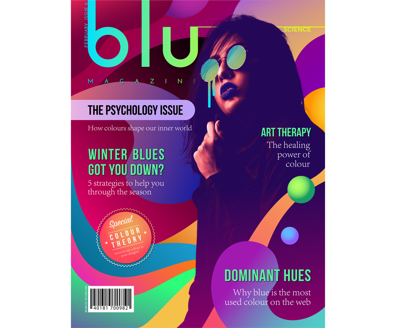
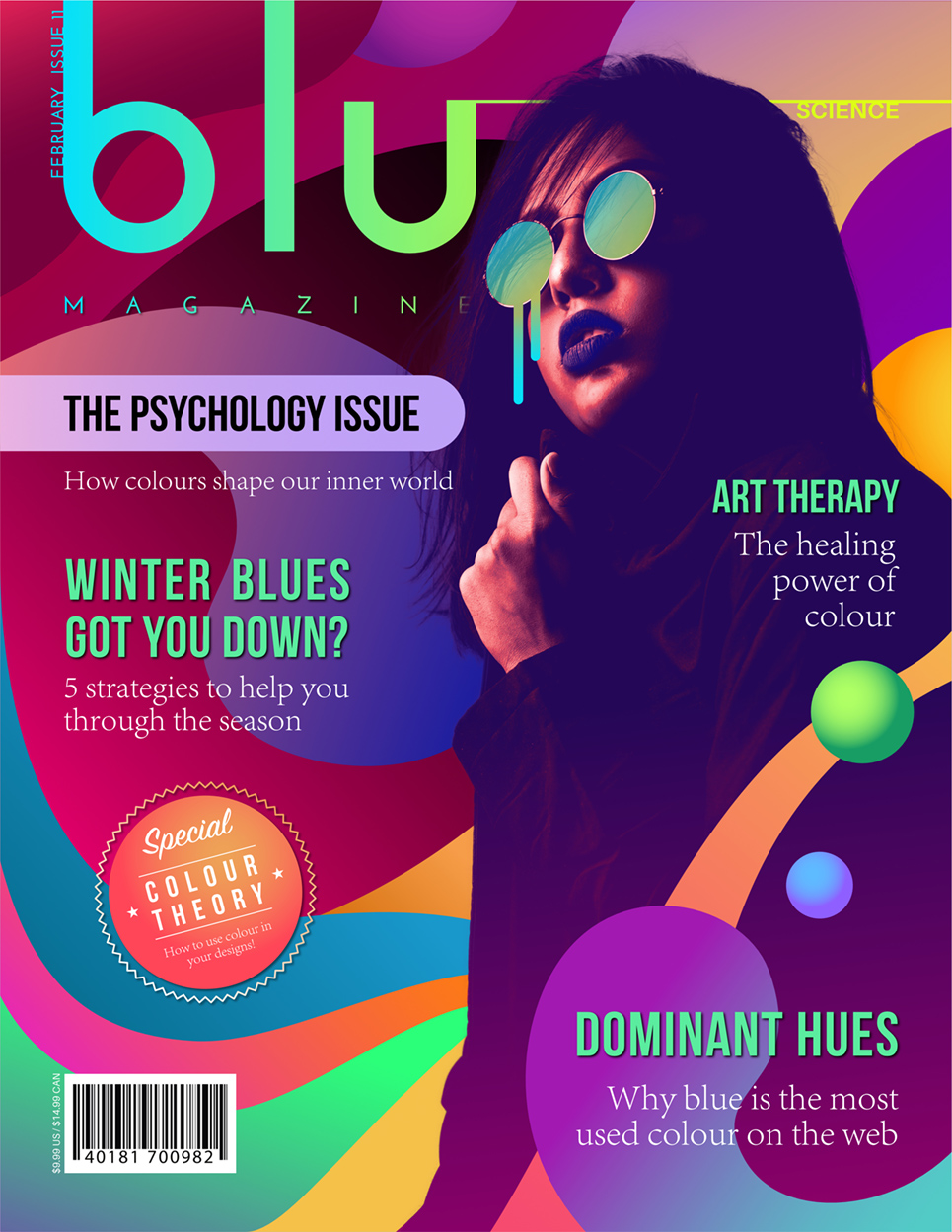
The theme for this month's issue of Blu was the psychology of color.
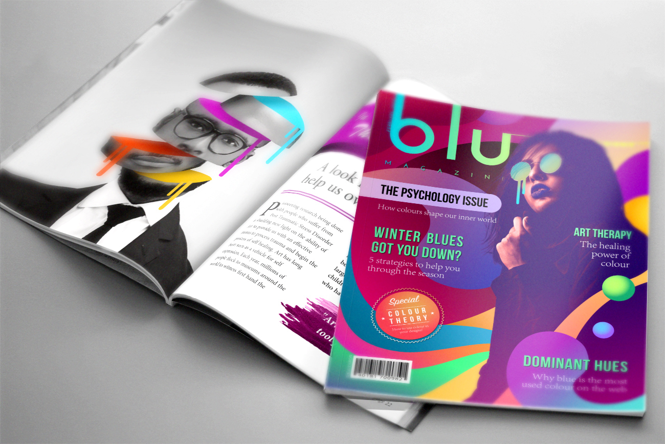
In keeping with the theme of this issue, I wanted its cover to be an absolute explosion of color. I incorporated photography and vector assets into a cohesive design while experimenting with color harmony and abstract shapes as a way to reflect the intuitive feelings that colors invoke within us. I also added the circular "special" sticker as a device to grab potential buyers' attention as well as to introduce more variety to the overall design.
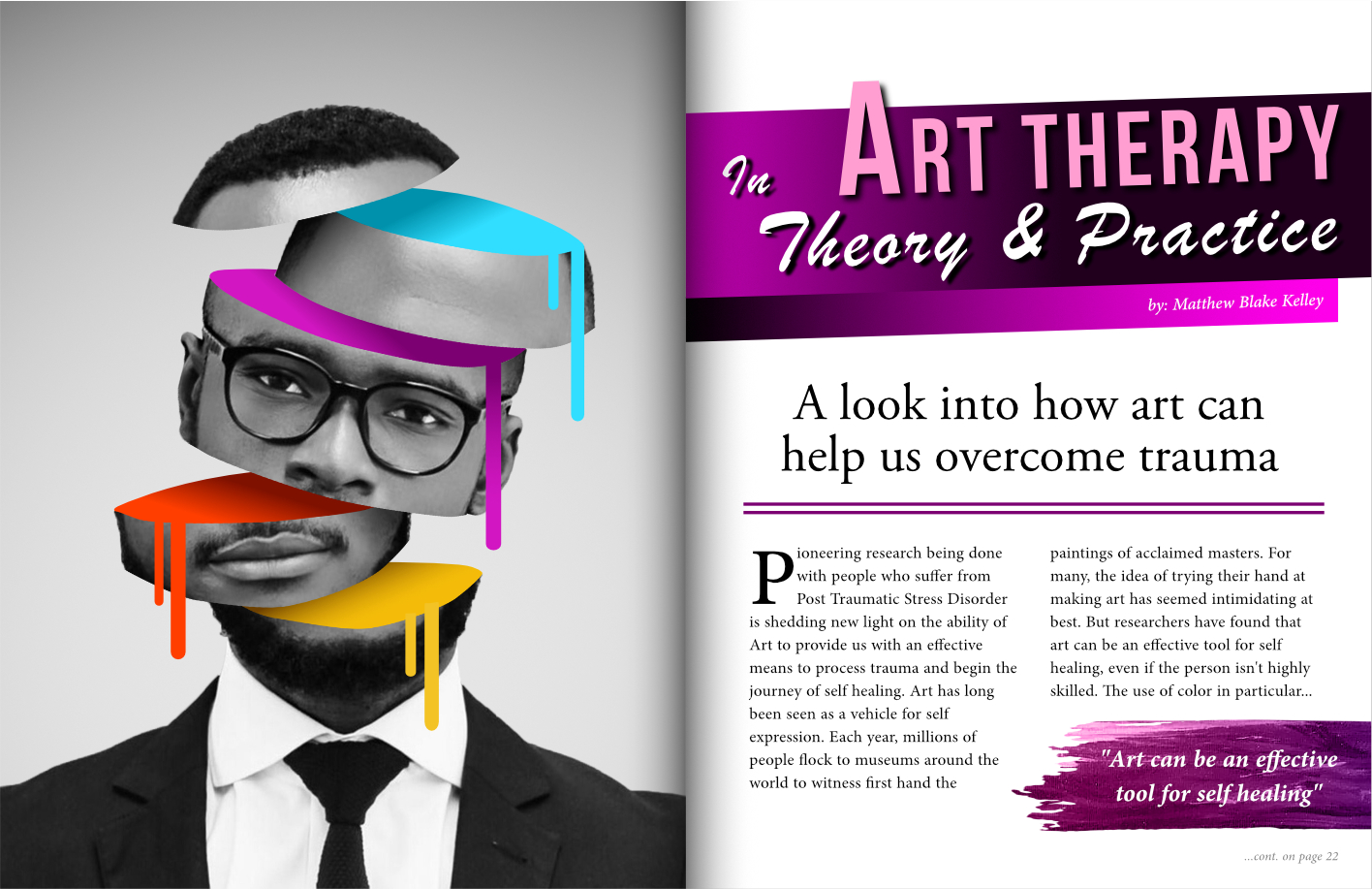
The article on this two-page layout is about how color has the power to transform and heal us. I decided to employ photo manipulation techniques to illustrate this concept by breaking apart a desaturated portrait of a man with little emotional expression on his face to reveal the vibrant colors hidden within. The dripping effect on the pools of color in the man's face are a visual tie-in to the same element found on the cover design.
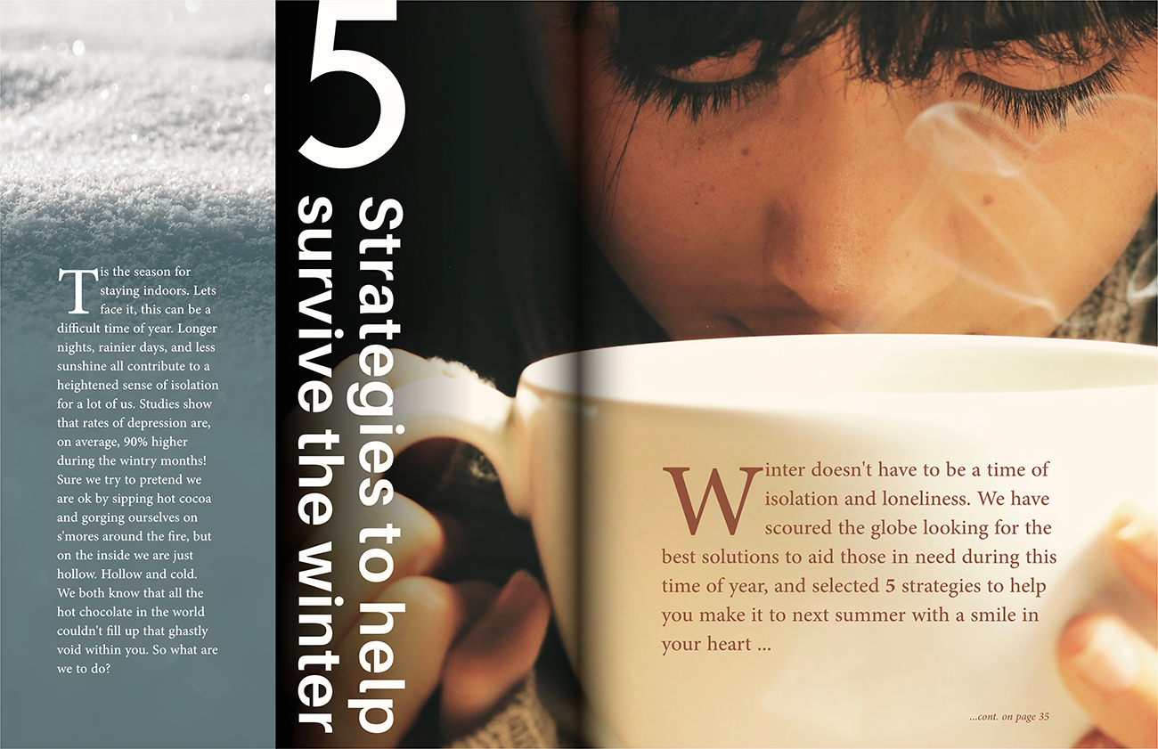
Though the overall subject matter of this article involves winter related depression, I wanted to emphasize the warmth and hope that the article is attempting to provide to the reader. To achieve this, I selected photography with warm and cozy subject matter and adjusted the colors to the warmer end of the spectrum. Explore the other issues below to see more!
