
Project: Blu Magazine
Role: Graphic Design, Illustration
Tools: Pencil & Paper, Procreate, Photoshop, Affinity Designer
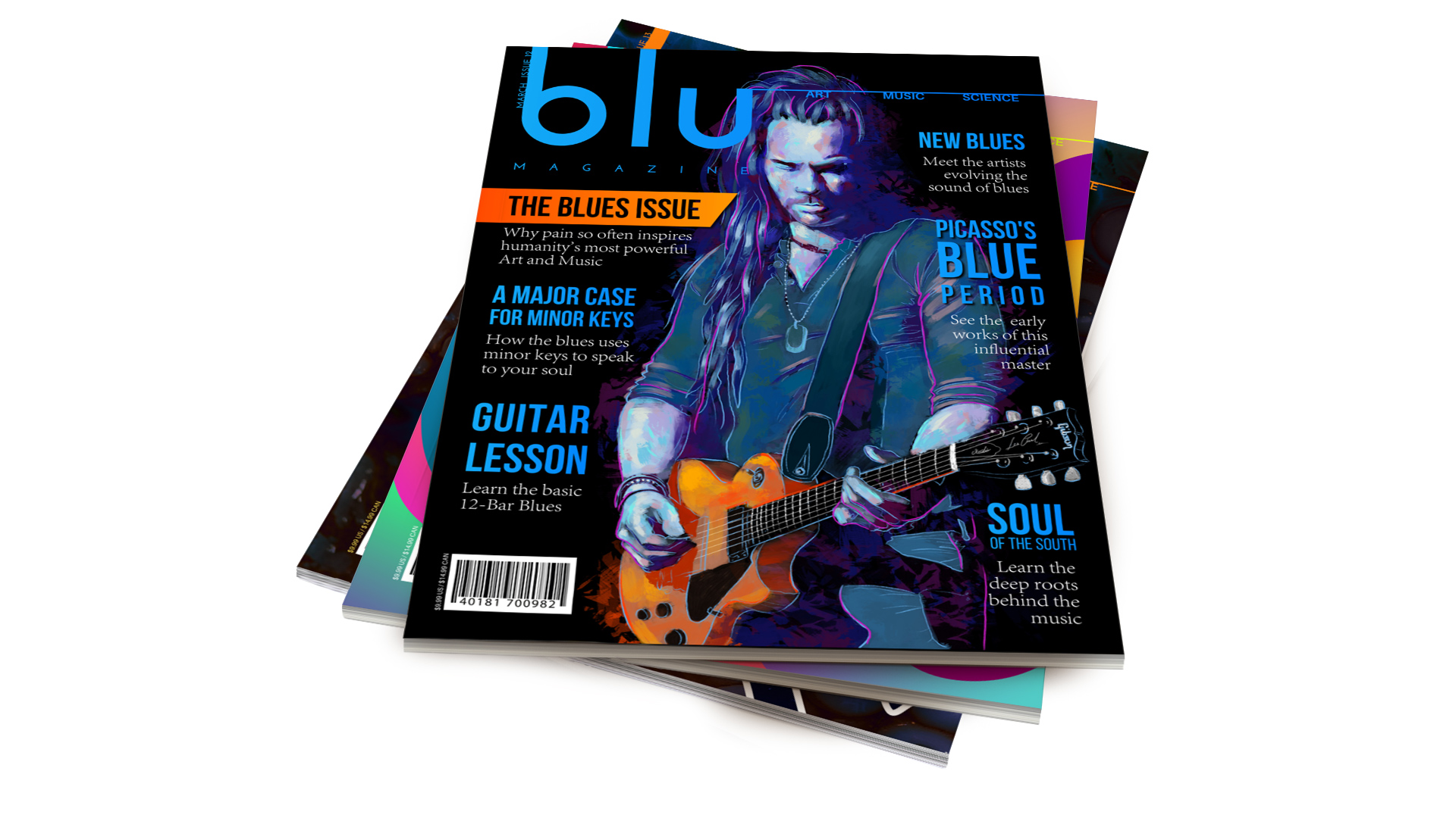
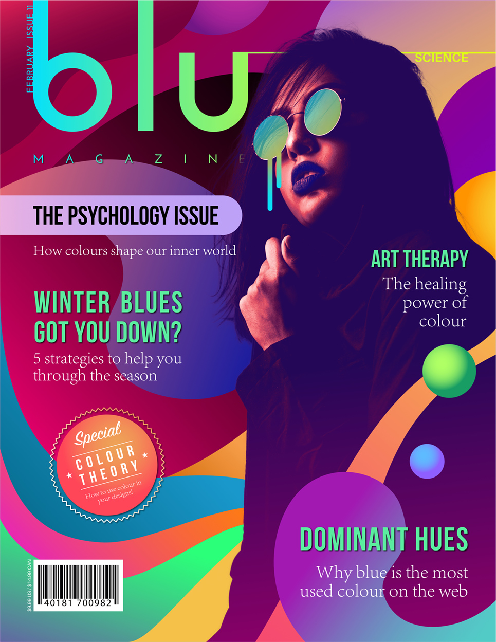
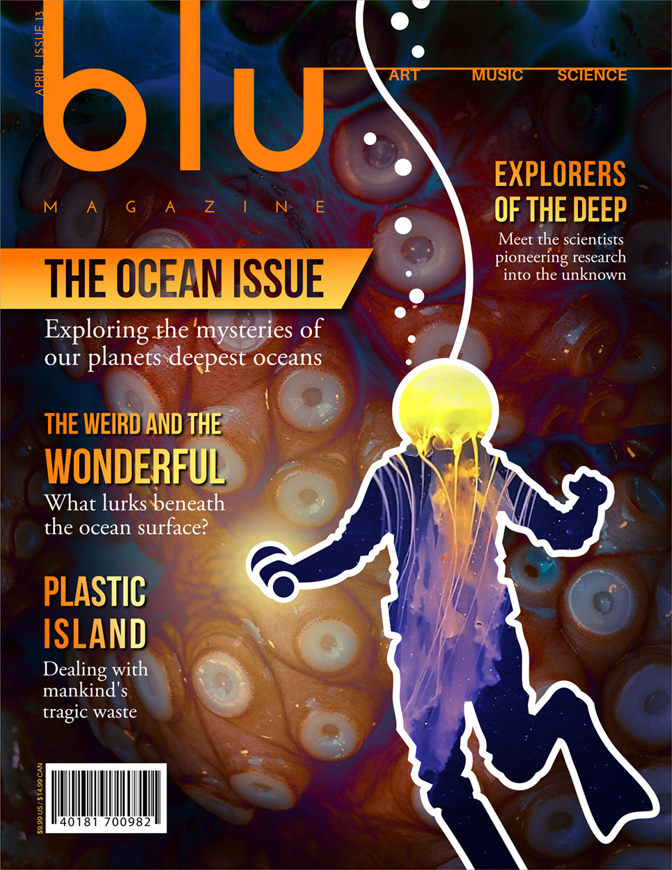
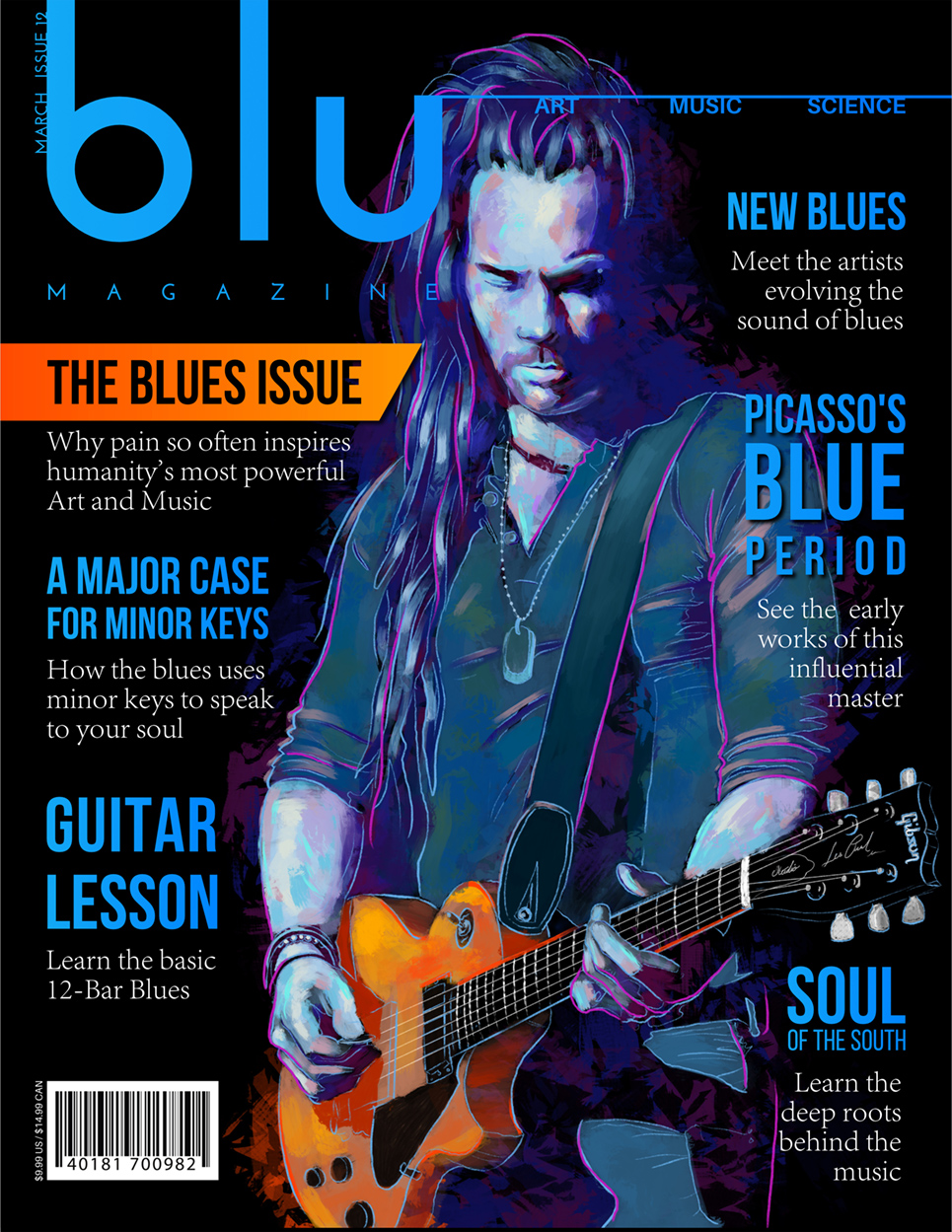
Blu magazine is a monthly publication that explores anything and everything related to the color blue. Blu is a self-guided project intended to showcase my current skillset as a graphic artist and designer. Its aim is to demonstrate solid branding, typography, layout, color theory, illustration, and photo manipulation techniques within a cohesive design.
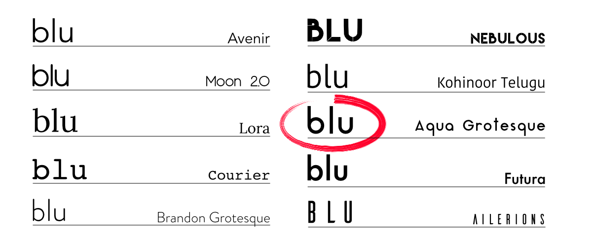
The target audience for this publication was young men and women between the ages of 25-35. It was important that the font chosen for the logotype reflected the clean modern feel I had in mind for the magazine's branding. In this case, I decided on the sans-serif "Aqua Grotesque" for its crisp and elegant rounded forms.
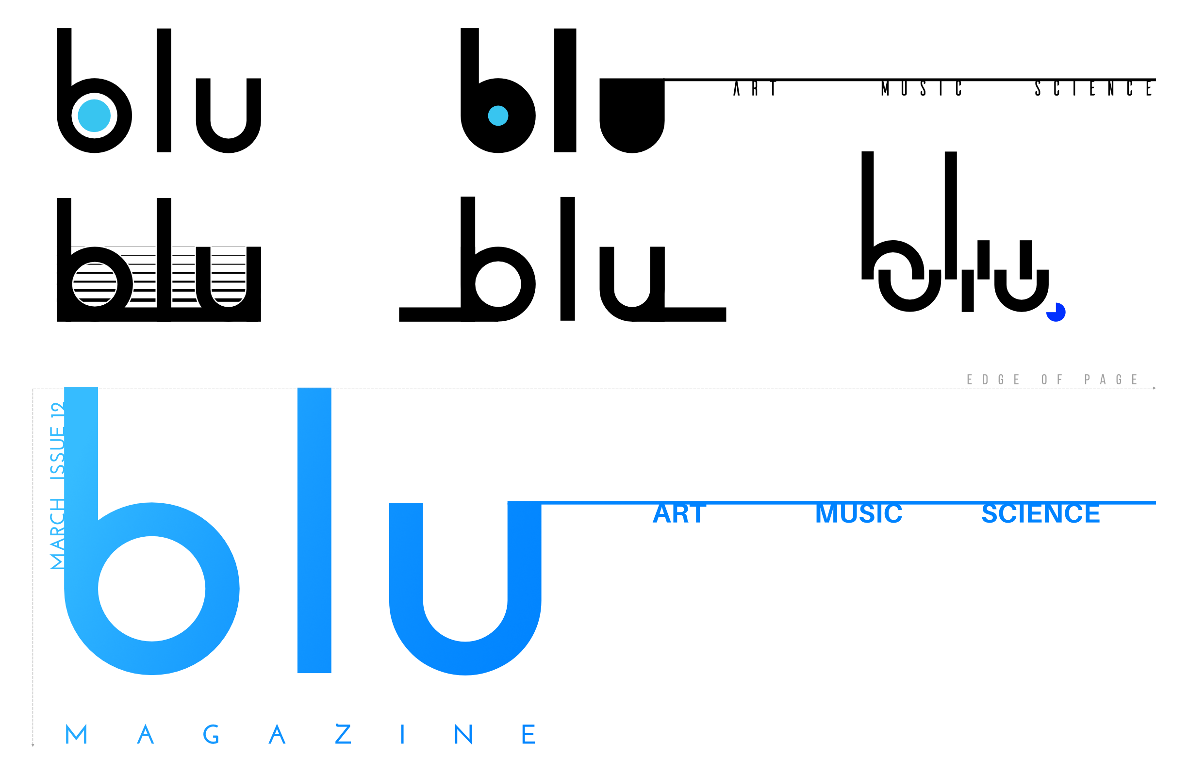
After some experimentation with the logotype and its placement, I ultimately chose to go with a clean, bold treatment that is easily recognizable and doesn't overly compete with the cover imagery. I also decided to run the letterforms off the page to open up the composition and keep the cover designs from feeling too boxed in.
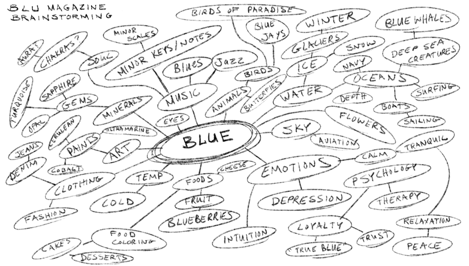
Early in the design process I sketched out a map of associations that came to mind when thinking of the project's core concept. Through this exercise I came up with three underlying themes, each represented by its own issue.
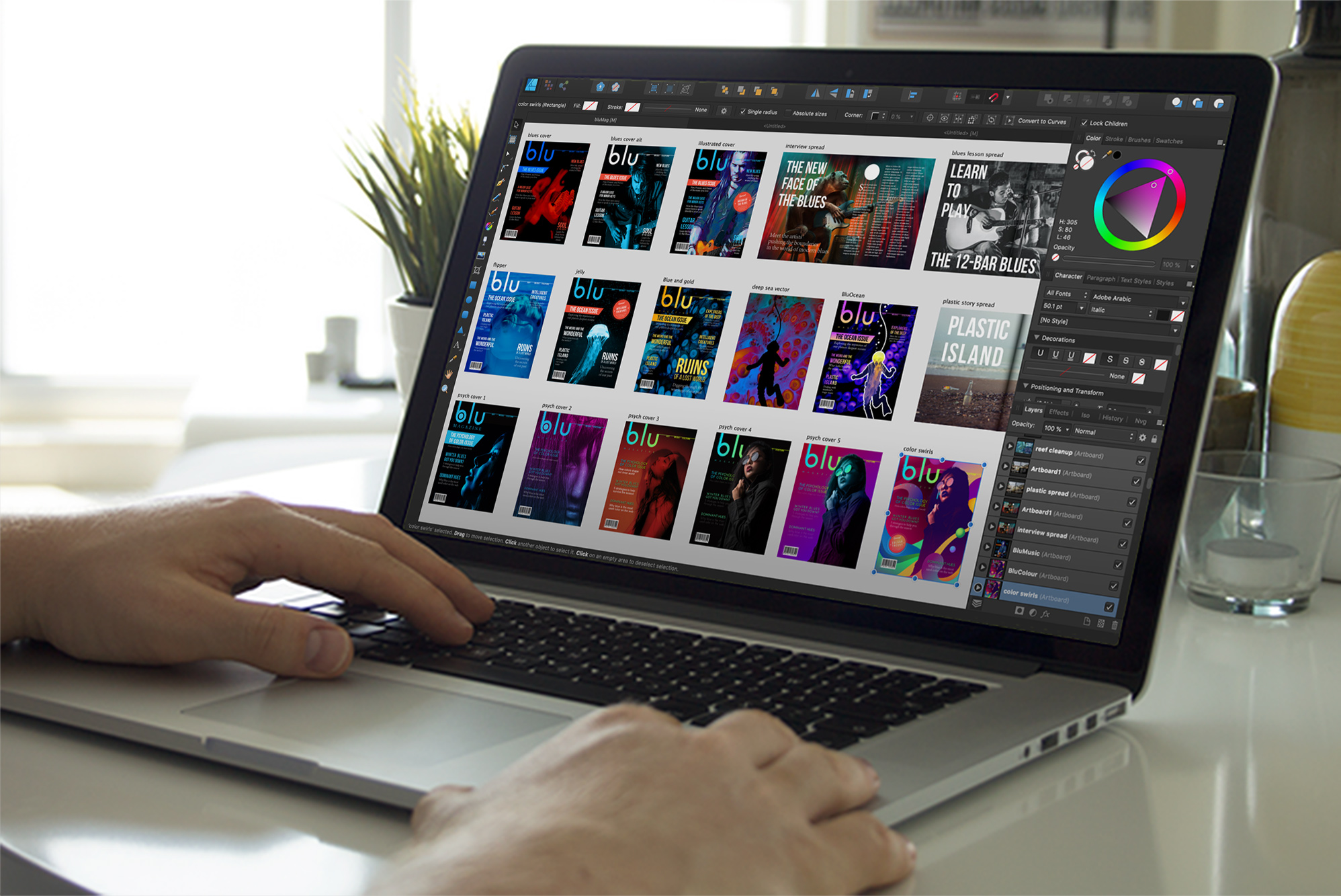
Many versions were created for each cover and spread design. One of the greatest tools in any designer's arsenal is the power of iteration.
The visual problems presented by the blu magazine project required a diverse range of design solutions including illustration, photo manipulation, grid-based layout design and typography. One of the key lessons learned in the process of working on this project was the importance of establishing visual hierarchies through the use of contrast and scale to inform your typographic layouts, especially in editorial design. While each cover is unique and related to that month's theme, there are certain design elements that remain consistent to establish a cohesive brand. To name a few, the theme tab, logotype placement, and article headline font are repeated on each cover. Explore the other issues below to see more!
