
Project: Quantik Branding Suite
Role: Graphic Design, Branding
Tools: Pencil & Paper, Photoshop, Affinity Designer

This project aims to meet the graphic design needs of a tech startup focused on the area of quantum computing. The company needed a name, logo, and corporate branding package invoking the feel of "hand-wrought" analogue materials (i.e. ink and paper) while still coming across as bleeding-edge high tech. Deliverables included a logo and logotype treatment for the company, a complete suite of branding materials, and mockups of how the logo might look on signage for the company's office.

Early in the design process I always prefer to explore possible solutions in the sketchbook before moving into graphic design software. In order to communicate what the company does to a wider audience, I chose to combine symbols of a simplified computer chip surrounded by an electron cloud. The name Quantik is a combination of the words quantum and technology which felt more modern and less generic than Quantech.
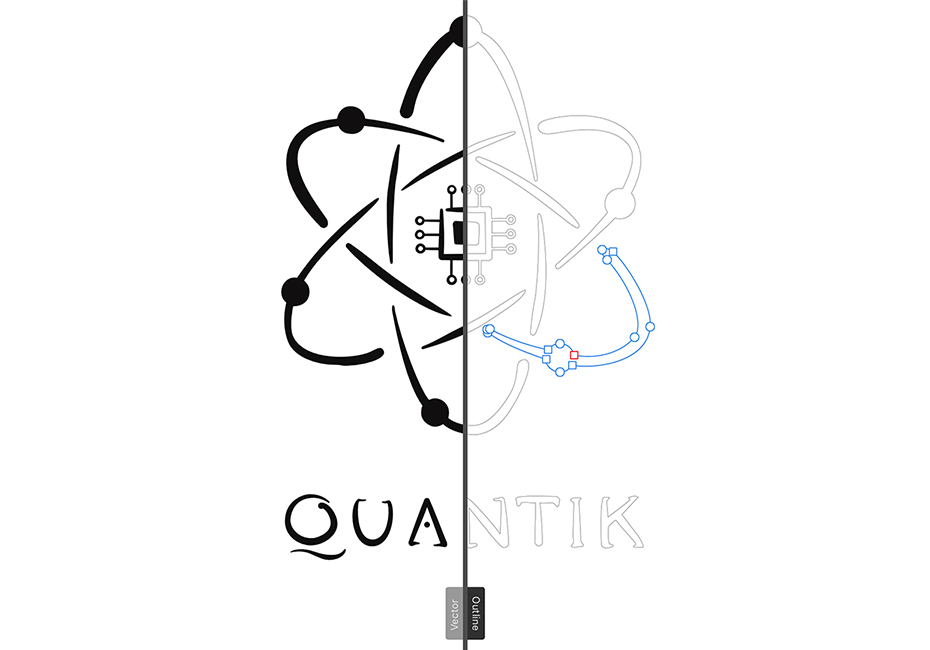
After selecting the best sketch, it's time to build the logo as a clean vector image while keeping the "hand-wrought" ink and paper feel specified in the design brief. To achieve this, I intentionally made the marks of the logo a bit uneven as if drawn by hand.
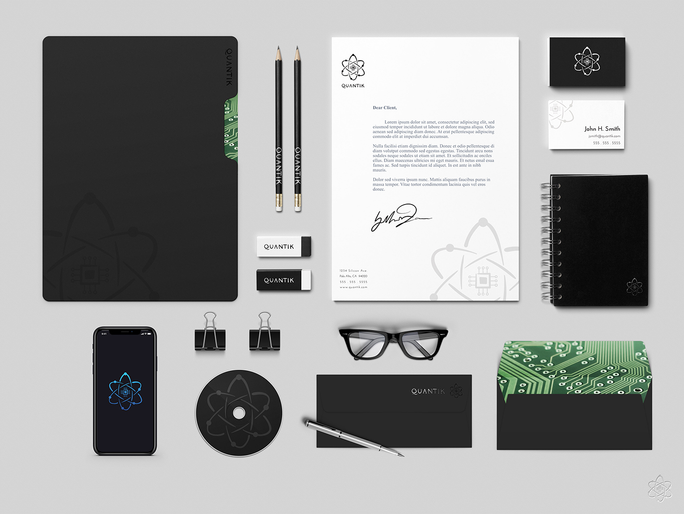
Here we see the entire branding suite for the company. The goal was to make a logo that was versatile enough to be used on a wide variety of applications.
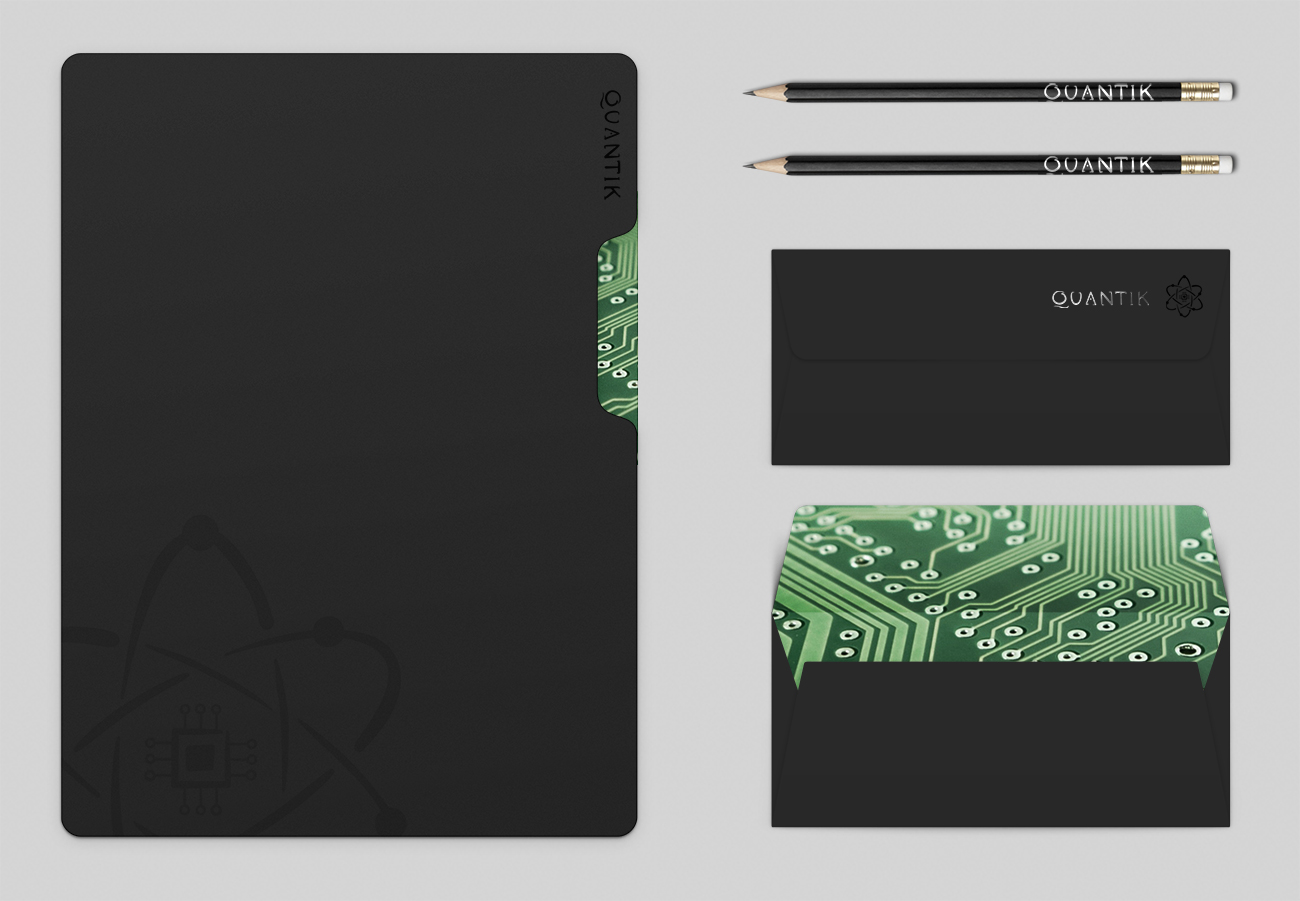
Throughout the project I aimed to evoke a high end "lux" feel. I incorporated a black on black color scheme with metallic foil accents to achieve this upscale character. Touches like the rich green imagery of the circuit board juxtaposed against the black color scheme provide a nice contrast without detracting from the overall minimalist aesthetic of the design. By leaving its exterior design clean and refined, the internal circuitry of the envelope provides a nice element of surprise and visual impact when opened by the client.
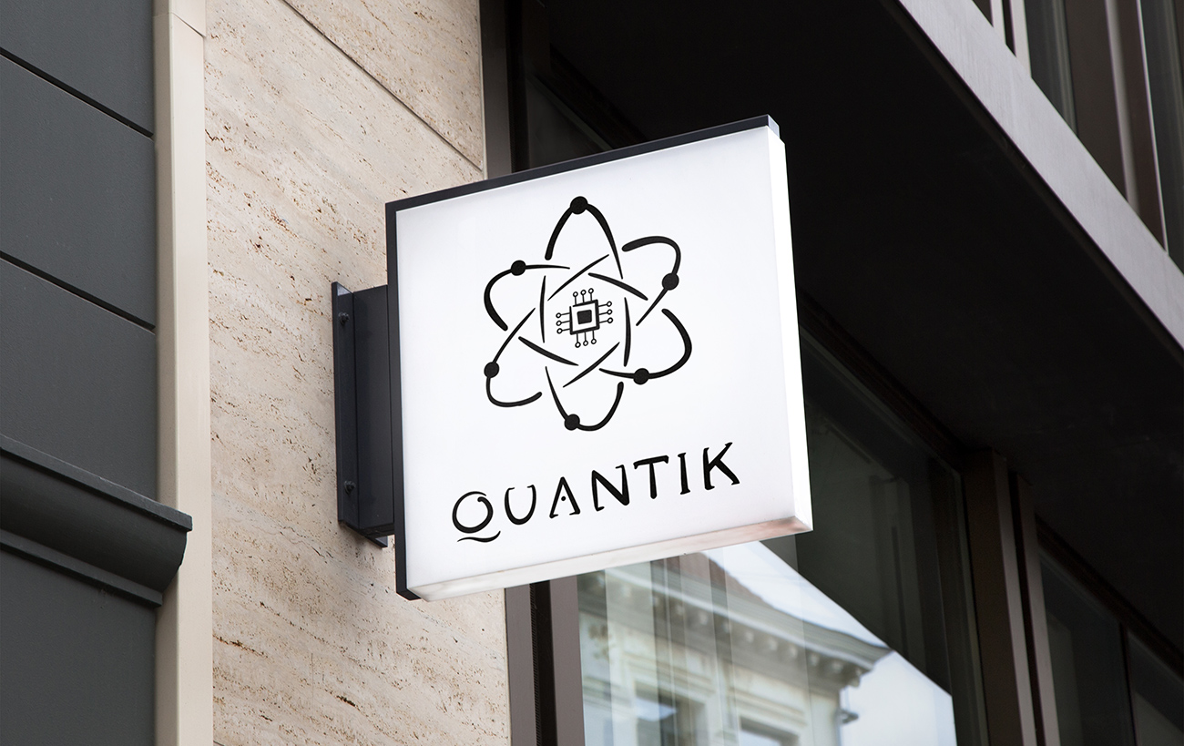
The true test of an effective logo is two-fold. Is it simple enough to be recognizable at a glance? Does it remain legible all the way down from the size of a postage stamp up to the size of a billboard? I feel that this logo succeeds on both counts while delivering on the style required by the original design brief.
