Projects: One-off designs
Role: Graphic Design
Tools: Pencil & Paper, Photoshop, Affinity Designer
In addition to the more comprehensive case studies on the design page, I wanted to showcase a “Designer B-Sides” section. This eclectic section of self-guided projects ranges from advertising to product and publication design. Check out the examples below for bite sized design appetizers. When you’re ready for the main course give me a call.
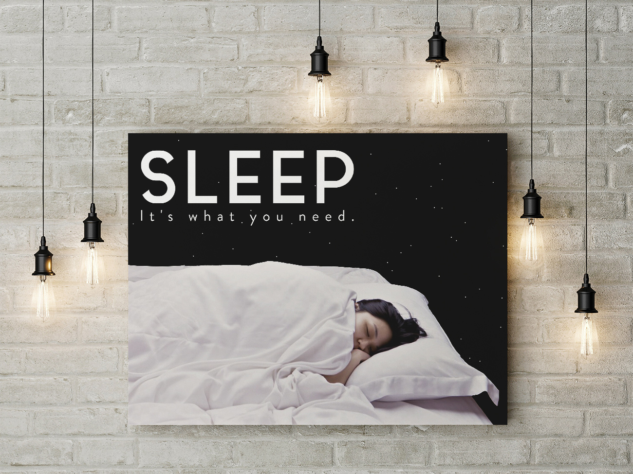
This design is the result of a challenge asking for a public health poster containing the slogan, "Sleep: It's what you need." The brief required that the execution be in a style that is the antithesis of my usual artistic sensibility. Since my go to style typically leverages hand illustrated elements, in this case I opted to use photography and a clean bold type treatment.
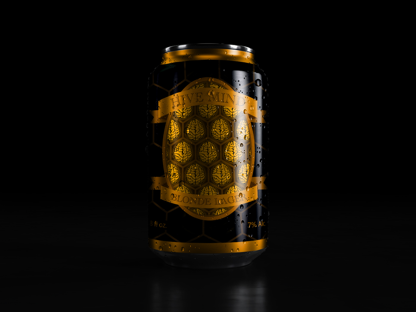
This label design was created for a small local craft brewery that was seeking a fresh look for their new line of seasonal beers.
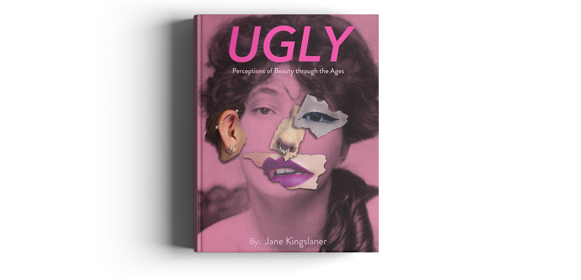
This is a cover design for a title examining the shifting quality of societal standards for feminine beauty throughout the ages. With an ironic sentiment in mind, the title Ugly was given as part of the design brief. The brief also specified I must communicate the idea that beauty is in the eyes of the beholder and therefore subjective, while keeping the design objectively appealing and attractive to a wide audience. To fulfill this challenge, I chose a photo of a woman from the more classical 20’s era as a base image; I then layered in features of various women from alternate time periods to appear as though pieces were torn out of a magazine to create a collage of the “perfect woman.” The pink tint serves to reinforce the notion of societal stereotypes associated with femininity.
